Creating a data pipeline for the first time can be daunting, but the look and feel of a product can make this process easier and faster. This is why we recently redesigned our modern data platform, and it’s been making a positive impact on our customers already:
“The fonts and colors are so pleasing to the eye. Man! If I go to another company where I get to shape [our data tooling], I will use Mozart again.”
“New UI looks slick, very well done.”
Here’s a look at the behind-the-scenes process from our designer, Shing-Yun Chiang, and our lead front-end engineer, John Setzer.
What were we trying to accomplish with this redesign?
Shing-Yun: This was a large-scale project with a strict time constraint: ASAP. I had the challenge of using only stylistic changes like colors and spacing to introduce hierarchy to each page, visually. It had to be clear to our customers where to start on each page. Each page had to be less busy. Not everything on a page should be emphasized. Certain actions and aspects on a page should be highlighted while the importance of other things should be decreased.
What was the redesign process like?
Shing-Yun: At a high level, I would look at one old page at a time and create a new design, then talk to the dev team to iterate to the final version. I talked to Dan (our CTO), John, and Matt Murch (FE engineer) for almost all the pages.
We didn’t have a design system before, so I had to create a design system starting with this project so that we could reuse the components.
I would do a design handover to the developers — the process was a bit rough because our product manager, Doo, wasn’t on the team yet.
I split the pages into groups as well and then worked on them group by group before doing a handover of the whole design.
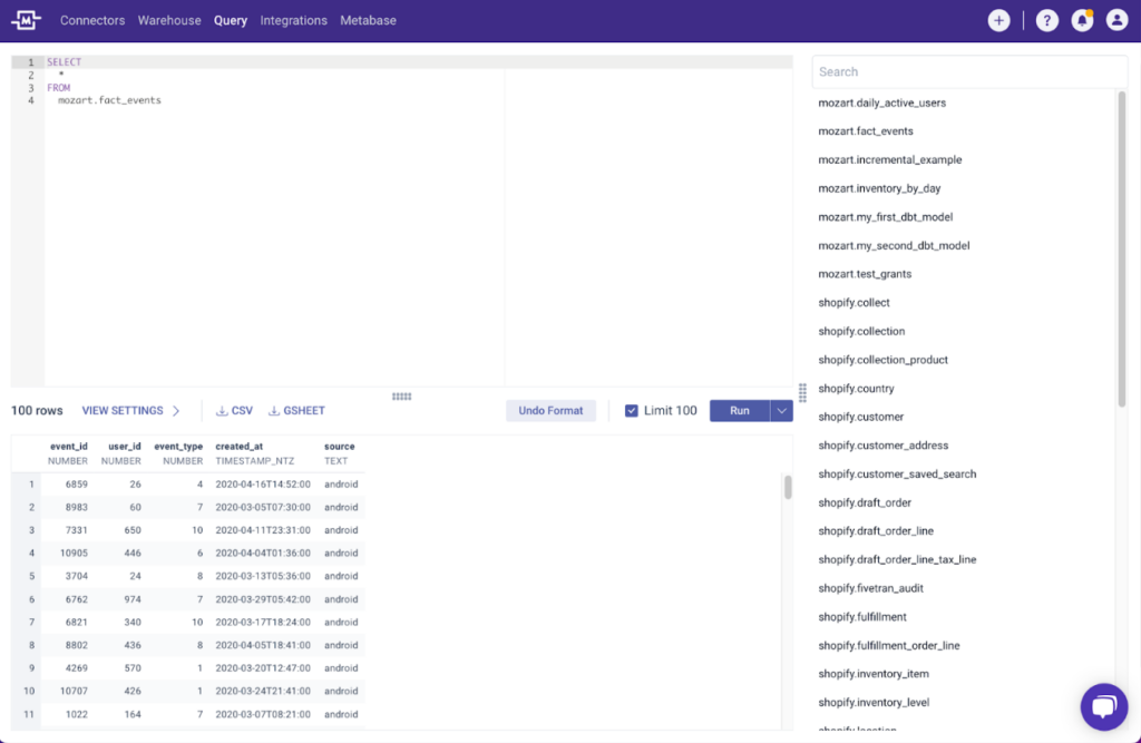
We used some product usage data for design decisions as well. If a button had been obvious in an old page but no one clicked on it, we considered removing it. Inversely, some features were hidden and we thought they would be helpful. For example, the “view settings” option on query results used to be just a chevron, so it was extremely easy to miss.
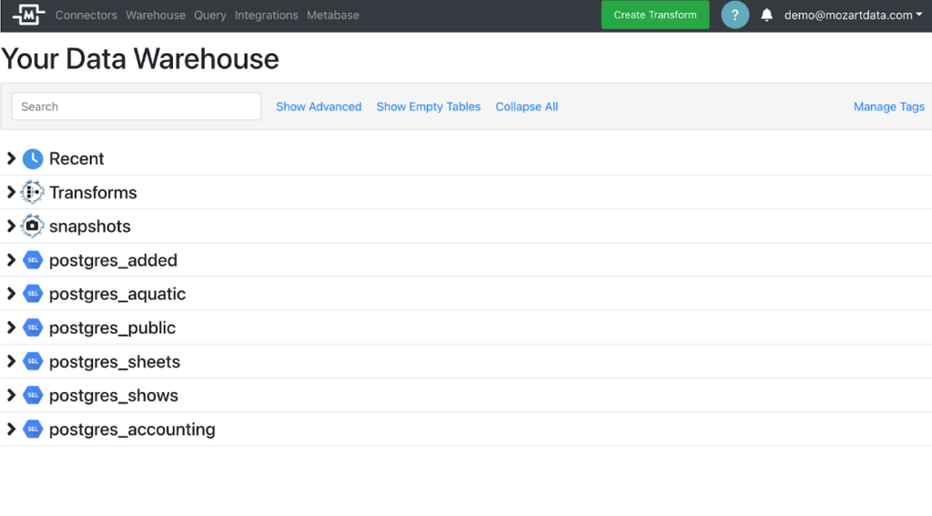
Before
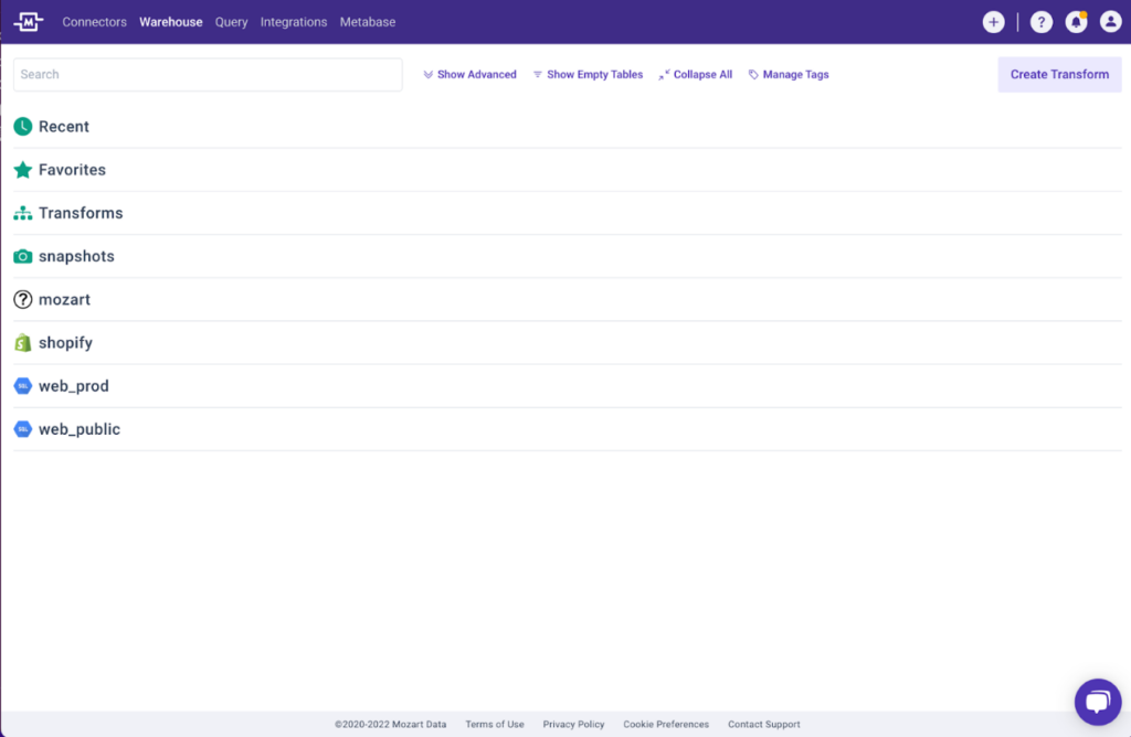
After
Blink and you could miss the chevron under the query editor for “view settings” in the old design. In the new design, there’s a neat text label.
What was the most difficult part of this redesign for you?
John: Long-running projects slowly suck the motivation out of work. You put in weeks of tedious work without a periodic dose of “job well done” dopamine rush. Specifically, what feels like it should be the last 10% of a project seems like it lasts for 50% of the project. When we finally launched, I felt like one of the NASA engineers jumping and crying at mission control after years of work finally resulted in a rocket launch. I am super grateful for everyone that helped build, test, and deploy this project.
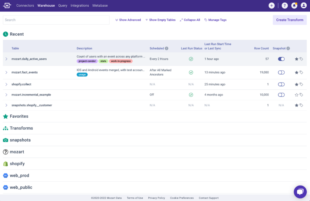
Shing-Yun: The warehouse page. It’s the most complicated with the most layer-on-layer hierarchy. The page has an accordion design with schemas that expand into table summaries, which then expand into details on each specific table.
I was trying to make the existing structure of the page work, visually. I didn’t necessarily have a lot of options to make this page work, so I didn’t go through a lot of drafts. Some of the options for improving this page would have required a big lift, so we didn’t go that direction.
In the old version of the page, everything was crowded and emphasized. But the warehouse page really has a few clear priority actions — the rest are the user’s schemas.
Old vs. new warehouse page with accordion design completely collapsed.
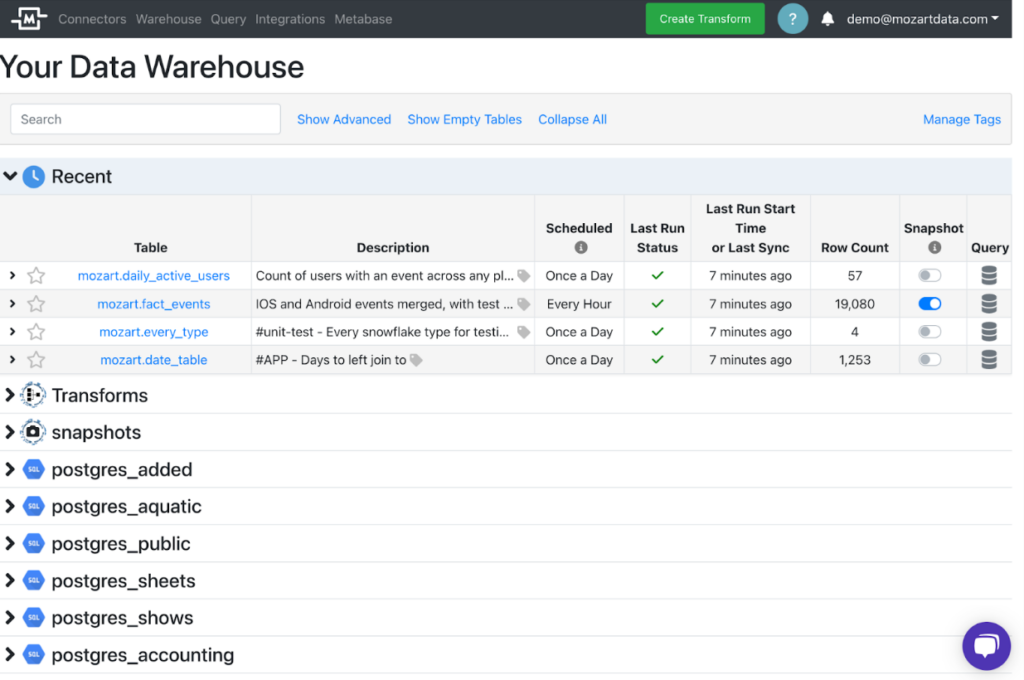
Old vs. new warehouse page with one schema expanded.
What was the most rewarding part of this redesign for you?
John: Reaffirming early feedback. I was nervous about how the redesign would be received until the first day we tested the redesign among our internal data analysts and they used the following phrases:
- “There’s something Zen about it that makes me feel good.”
- “Relieves stress. Calming feeling makes it easier to work.”
- [After testing the design and switching back to production] “I already miss the new version.”
Shing-Yun: If I could get the warehouse page to work, that was going to be a huge success. When Adam (from our internal data team) used it and said he felt “Zen,” that was very interesting to me. The standardized color scheme and the spacing makes people feel like the tool is more friendly and accessible, so they can feel more relaxed.
In the old version, both lines and background shading were used to differentiate the rows in the warehouse page.
In the new version, we’ve kept only the lines to delineate rows to keep things clean and reduce information load on the user.
Are there any little-known facts about the redesign?
John: The redesign was the second-largest project in Mozart history. Mozart likes to run small incremental projects that take two to four weeks. The redesign took nearly four months and changed 88% of the files in the UI of the app. We’ve run redesign projects at previous companies, so we knew this was going to take a while, but it still took longer than we thought. The Mozart app is just over two years old, relatively small, and almost completely free of the cruft that long-lived software projects slowly accumulate. I can only imagine how long this would take on a larger software project.
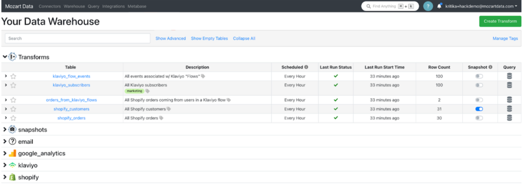
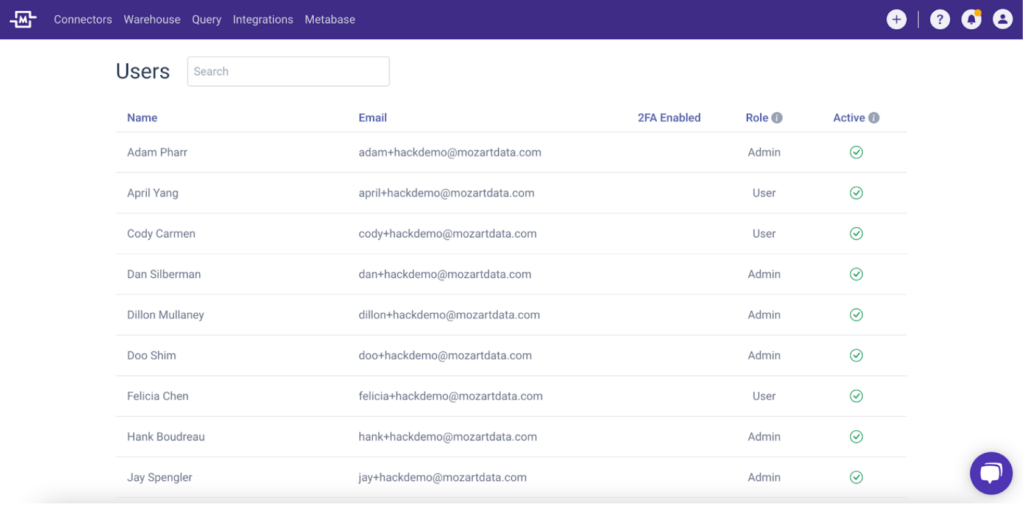
Shing-Yun: There are three table styles used in the app: large, medium, and small. There are a large number of tables and table types used throughout the app and they couldn’t all look the same because they have different functions. We also needed to create visual interest. In a future redesign, we might get rid of some of the table styles because there are so many.
The large style is used when the table is the main focus of the entire page, such as the Users page.
Medium is used for when the table is not the top priority and there are a limited number of data fields and actions that need to be displayed.
The table summary for a specific schema on the warehouse page.
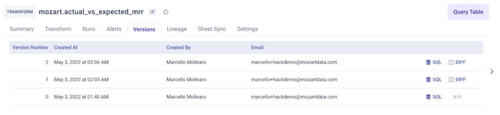
The version history for a specific transform.
Lastly, the small style is used for previews of actual data tables and other cases where there’s a significant amount of data to display.
What are some takeaways for future development?
Shing-Yun: While Figma was very helpful for drafting the design system, we started using Zeplin as well because it was preferable for developer handoff. Exporting a design from Figma to Zeplin made it more clear to our frontend team when a design was ready to be implemented. With a large number of assets to manage, we also felt that Zeplin was better for asset sharing.
John: Here are some of my thoughts for software engineers:
We didn’t always anticipate which technical challenges would be more time-consuming. Failing to account for setbacks in project planning can affect organizational flexibility.
For example, it took us time to optimize how we were using some of our tools. Storybook is great. We started using it at the start of this project. It encourages you to write small components with good interfaces in the same way that TDD encourages you to write functions with good interfaces. Tailwind CSS was overall a net positive, but it does have some design tradeoffs. It can take a few weeks to get used to it and a few more weeks to memorize the synonyms it assigns to some CSS rules.
Restyling components like buttons that have many interactive states (normal, hover, focus, active, etc.) can also be super time consuming. We suggest trying to find a component library where you can inject a color palette into a config file and have the compiler output a set of branded inputs.
If you haven’t discovered our redesigned platform yet, watch a quick two-minute walkthrough here.